Category Archives: Renovation

Nice Geometry You Have There

I’ve always loved the geometry of this house. It photographs especially well from certain angles. The place is essentially a set of interlocking cubes. The glass garage door was added this spring, and makes a huge impact.Screen Shot 2015-12-15 at 5.34.24 AM

Here’s a before shot from a similar angle in December 2012. Painting the underside of the roof in a contrasting color really brought out the horizontality, emphasizing the roof as a design element. Notice how we painted the wrought iron in a contrasting color too. I’m really glad that Chuck had the vision to take on this project.

DSC_0075

Ultra-Modern Morro Bay Kitchen

Chuck always has something going on. Here’s one of his latest projects in Morro Bay: an ultramodern kitchen. I love the combination of butcher block and quartz on the island countertop.

The wood is from Grothouse in Pennsylvania, hand-built from walnut, while the countertop is Caesarstone’s Pebble pattern. We’ll have more photos soon. Image 5

Before & After: Scary Bedroom to Fab Kitchen

Chuck really has an amazing vision, even with the scariest spaces. Here’s what the kitchen looked like after the renovation was completed in March 2013:

DSC_0220

And here’s the before in December 2012, just three months earlier: a dank bedroom. The only thing that remained the same is the original oak hardwood floor and the exterior walls. The windows turned into sliding doors, adding another backyard access besides the master bedroom. We pierced the wall on the left with an opening to the living room (which required a structural engineer and a beam to support the roof).

DSC_0038

Normally I wouldn’t recommend removing a bedroom because of the hit to resale value, but in this case, the third bedroom was an illegal unpermitted space that didn’t add to the sale price (and which we brought up to code). We didn’t lose any bedrooms with this renovation.

We also raised the ceiling. It’s amazing how much that simple change can transform a space. Before, it’s a standard eight feet:

DSC_0039

After, the ceiling slopes up from nine to a grand ten feet:

It’s really cool how Chuck transformed the closet into the cooking area. When other people ran from this project, Chuck ran to it.

DSC_0040


Fabulous Photo Spread in the Tribune!

It’s been a while since we’ve posted; so many exciting things are happening. We’re catching up the blog now. In July, our house was featured on the cover of the San Luis Obispo Tribune Home & Garden section. It’s always interesting to find out what someone else sees in your home, and really fun to look at the professional photos.

6KpBA.So.76

Photo: David Middlecamp

The gas fireplace insert was added this spring; it’s a Heat & Glo Cosmo, and at about $3,400 installed, one of the best investments we made in the house. The original wood-burning fireplace was unusable because the flue was broken; a fireplace insert solves this problem because the exhaust gases are routed through a metal pipe that fits inside the old flue.

We had prepared for a fireplace in early 2013. The plumbers and electricians were underneath the house for several weeks replacing all of the corroded old pipes and faulty wiring; there was originally no gas line or electricity to the fireplace, so that was a convenient opportunity to install both. Like most gas inserts, ours requires both a natural gas and power source for the electronic ignition. Although wood fireplaces are romantic, cleaning up the morning after most certainly is not, and it’s wonderful to have the soft, flickering light and warmth at the touch of a button.

Our New Modbox

We installed our new Modbox mailbox last weekend. It’s one of my favorite things.

modbox

It couldn’t have been simpler to follow the included directions. I love the paprika and white color scheme, the rakishly angled post, and the red metal flag. It arrived less than a week after we ordered it. If you’re looking for a well-made, modern, American-manufactured mailbox, this is it.

For a font geek like me, it’s cool that the numbers Modbox sells to go with the mailbox are Neutraface, based on architect Richard Neutra’s designs from the mid-20th century. Chuck has used Neutraface in all of his marketing materials and websites for years, so the Modbox people clearly have good taste.

We’ve been adding many finishing touches to the house and I will post a lot of photos soon. Stay tuned.


New Mailbox From Modbox

We just ordered a new Modbox mailbox. The mailbox is one of the first things you see when you approach a house. A great one can make a fantastic first impression. After we went to all this trouble and expense to renovate the whole house, our cheap plastic tunnel mailbox on a rusting post doesn’t quite cut it. (All pictures below are from the Modbox site; I’ll post my own pictures when we install ours.)

Screen Shot 2015-03-15 at 7.48.59 AM

Here’s a funny thing about mailboxes: there’s a really limited selection of attractive post-mounted boxes that coordinate with a mid-century modern home. Almost no one sells a modern mailbox suitable for mounting on a street side post. That’s why I was so happy when Chuck found Modbox!

The people behind Modbox had a similar problem, so they decided to start their own mailbox company. The Modbox is inspired by mid-century mailboxes like this one from the 1961 Sears catalog. Modbox even created a sleek forward sweeping stand like the mid-century inspiration; the 65º angle gives a space age vibe.

af29f72c2b19138458526fa61952ea3b

Modbox comes in many different color combinations. We picked paprika and white, as the red will contrast beautifully with the soft blue gray and white house color scheme. Here’s a picture of the Modbox in front of someone else’s house. I’ll post pictures of our Modbox soon!

Screen Shot 2015-03-15 at 7.57.51 PM

The Front Yard Is Done!

Chuck has finished the front yard! I love it. In place of the weeds and crabgrass, we have a virtually zero maintenance landscape with palms, native grasses and flowers, and a super-efficient drip irrigation system – perfect for a place that can go 180 days without rain. This is the view from the right side of our living room, which overlooks other houses. The palms add shade, privacy and visual interest.

DSC_0003

DSC_0001

Chuck did all of the design and the work himself, except for excavating the three foot pits necessary for the palms. Our dense clay soil required a jackhammer! The irrigation required a lot of planning, because each plant has its own drip – no need to spray water all over the entire yard, which is a no-no during our ongoing drought.

10900183_10153012908329076_6683531614640829304_o

The precise grid of grasses coordinates perfectly with the geometry of the house. Chuck used two different sizes of gravel to indicate paths.

DSC_0004

Each tuft will grow to about a foot across.

DSC_0010

The additional seating area is really fun. Notice how the blue chairs reference the blue-gray house trim, and pick up on the overall coastal color scheme.

DSC_0005Now we a great yard to go along with our fantastic view.

DSC_0012
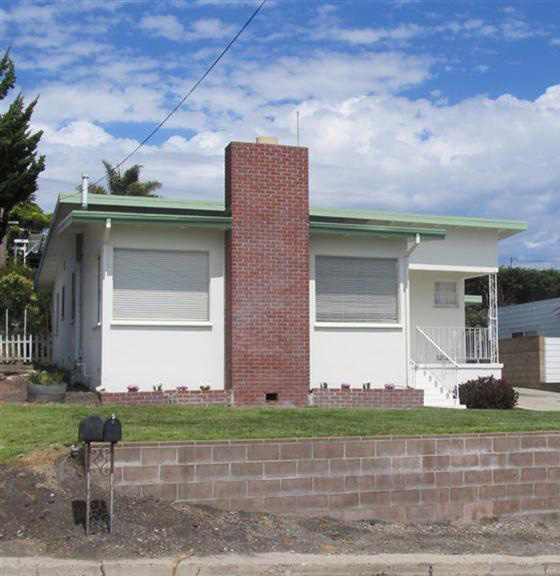
Here’s what it looked like when we bought the house in December 2012. What a transformation!

189757_01

Front Yard Preview

Our new landscaping in the front yard is almost ready for the big reveal. It has been weeks of digging out the old crabgrass, excavating three foot pits for palm trees, and installing a brand new drip irrigation system for the new drought-tolerant plantings. Here’s the view from the new seating area in progress. We’ll show the whole yard as soon as it’s done!

DSC_0010

The Power of Before and After, Part II

Here’s another of Chuck’s recent kitchen makeovers. It’s a Mediterranean-influenced space that reflects the style of the house. He kept the original clay floor tile at the homeowners’ request and styled the kitchen around it. The rich, warm palette of ochre, copper and azure sets off the white cabinets. And notice the custom wood countertop on part of the island – it’s another design feature.

Janell1

I love the solid copper apron front sink; it’s the centerpiece of the kitchen. Chuck loves to insert space for cookbooks, so the nook in the island is perfect. The open arch front pantry is another original kitchen feature that the homeowners wanted to keep. The blue Walker Zanger backsplash tile (their Cafe series in blue) adds a sunny atmospheric note.

Janell2Here are the before shots. It looks so much better now that floor tile isn’t on the countertops too! The island replaces the storage space that was lost when the ugly row of upper cabinets that blocked the window came out. The refrigerator was moved to the opposite end of the room, allowing better access to the panty. It’s another fantastic C W Quinn Home makeover.

janell before 2 janell before 1