Tag Archives: Color scheme

Sometimes Stains Are A Good Thing

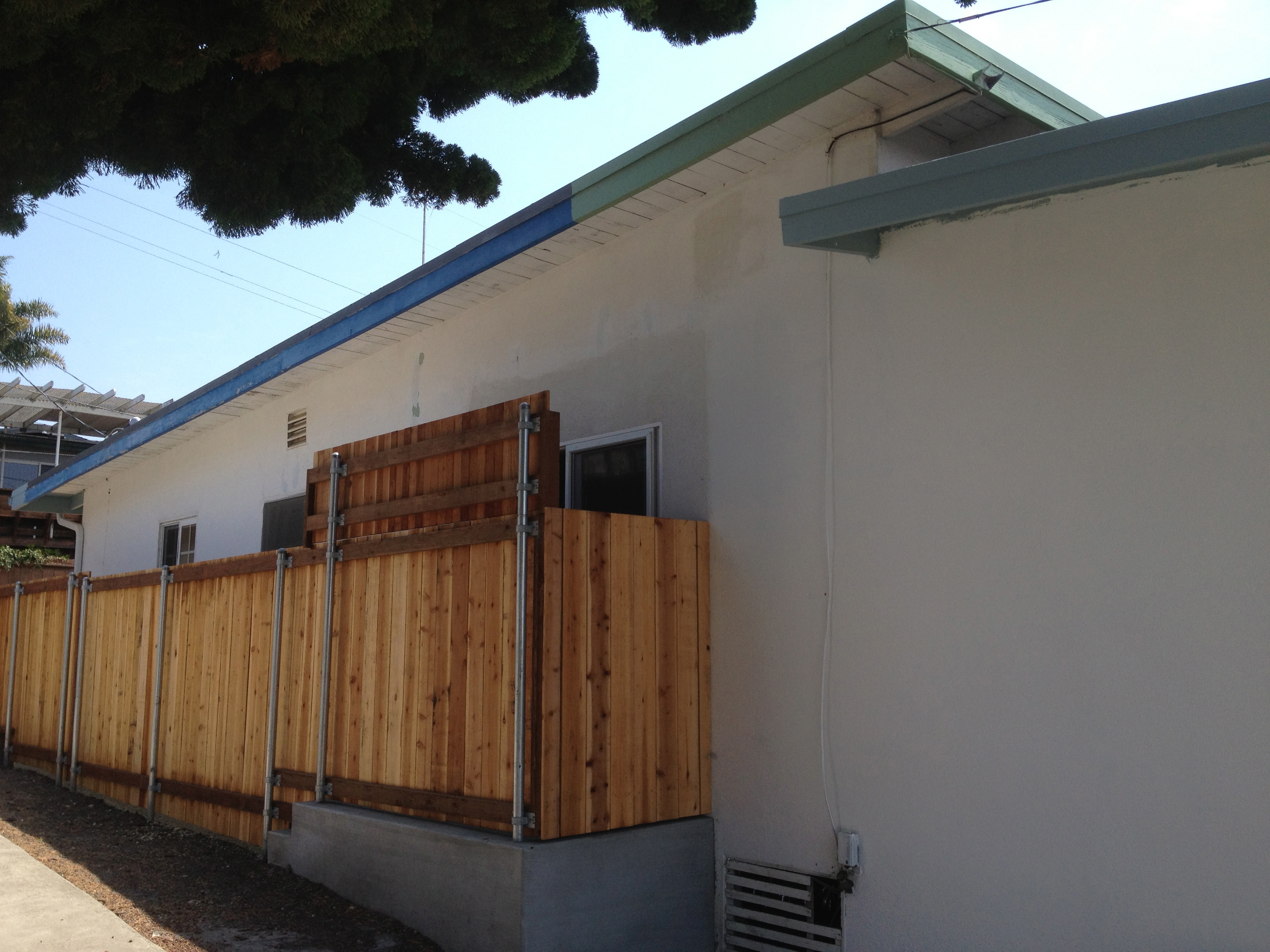
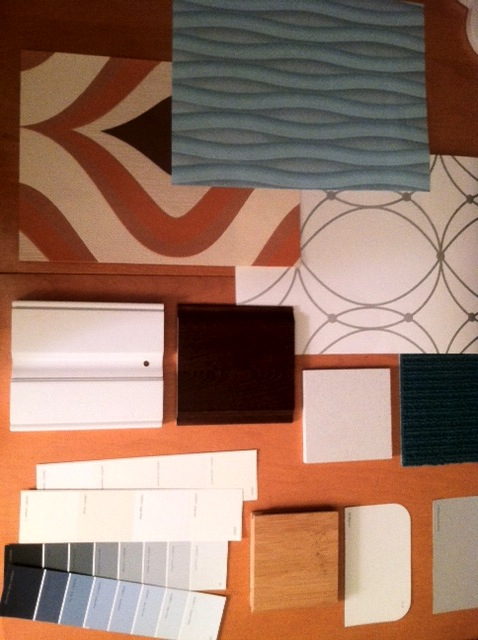
We just applied a stain to the redwood fence that screens the view from the kitchen into the neighbor’s house. It’s beautiful. Chuck specifically chose the silvery gray to coordinate with the interior color scheme. It’s a semi-transparent stain that still lets the beauty of the wood grain shine through.

DSC_0006
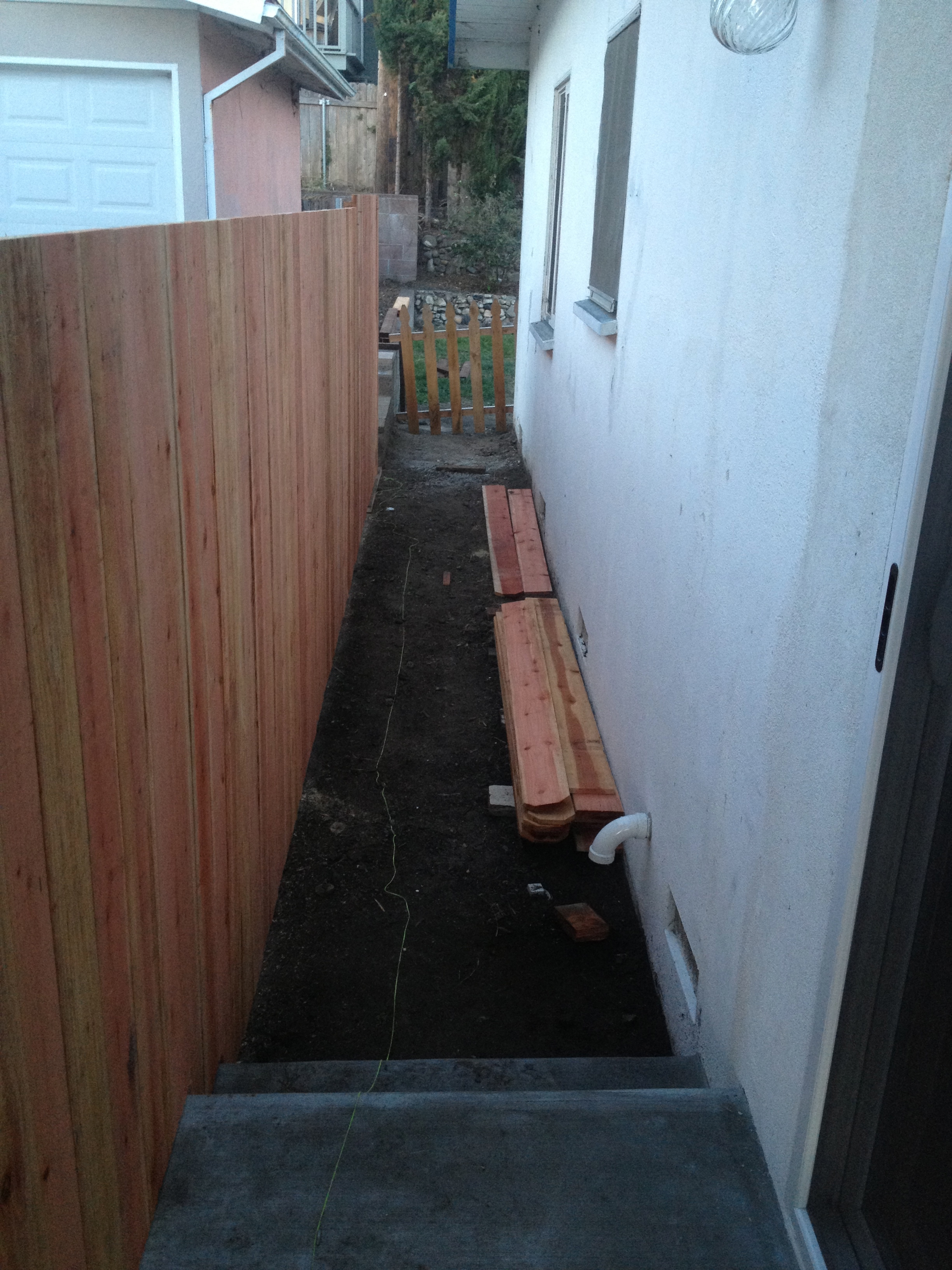
As a reminder, this is what the fence looked like unstained. Redwood is a handsome material, but when really new there can be wide color gradations that look garish. Eventually the fence would have naturally faded to a grayish color, but in our mild California weather with no rain for months at a time, the process would have taken years.

IMG_1344
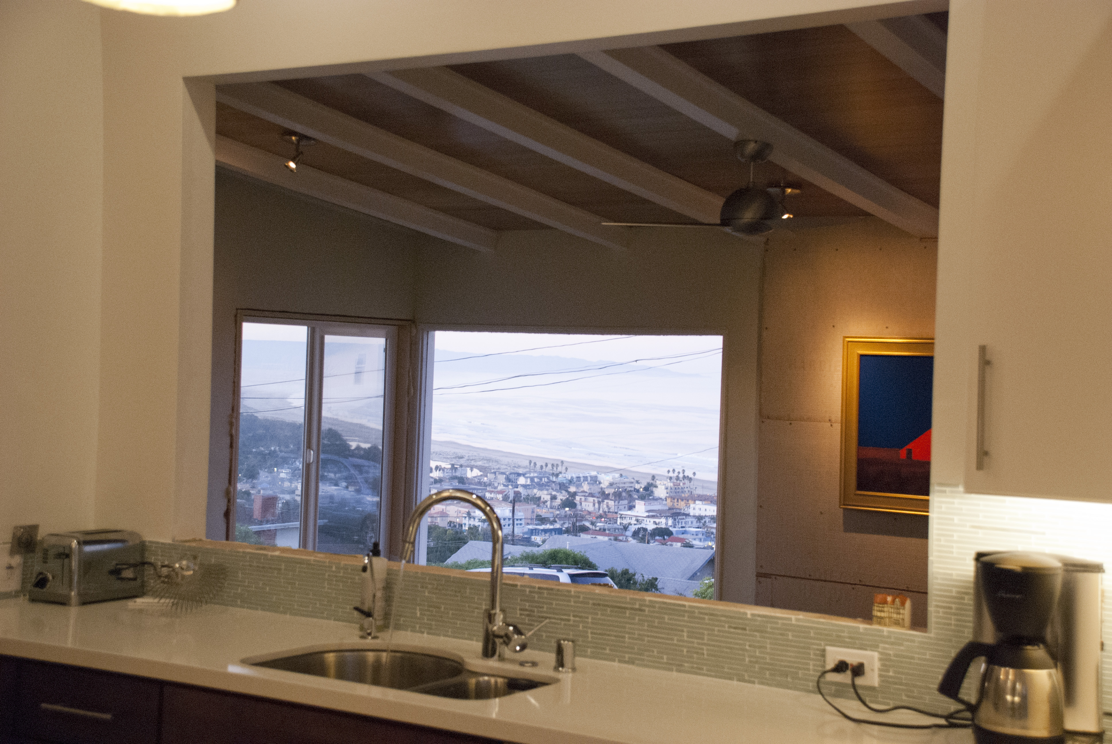
And here’s what the view looked like without a fence. Clearly we needed a privacy screen!

IMG_0990
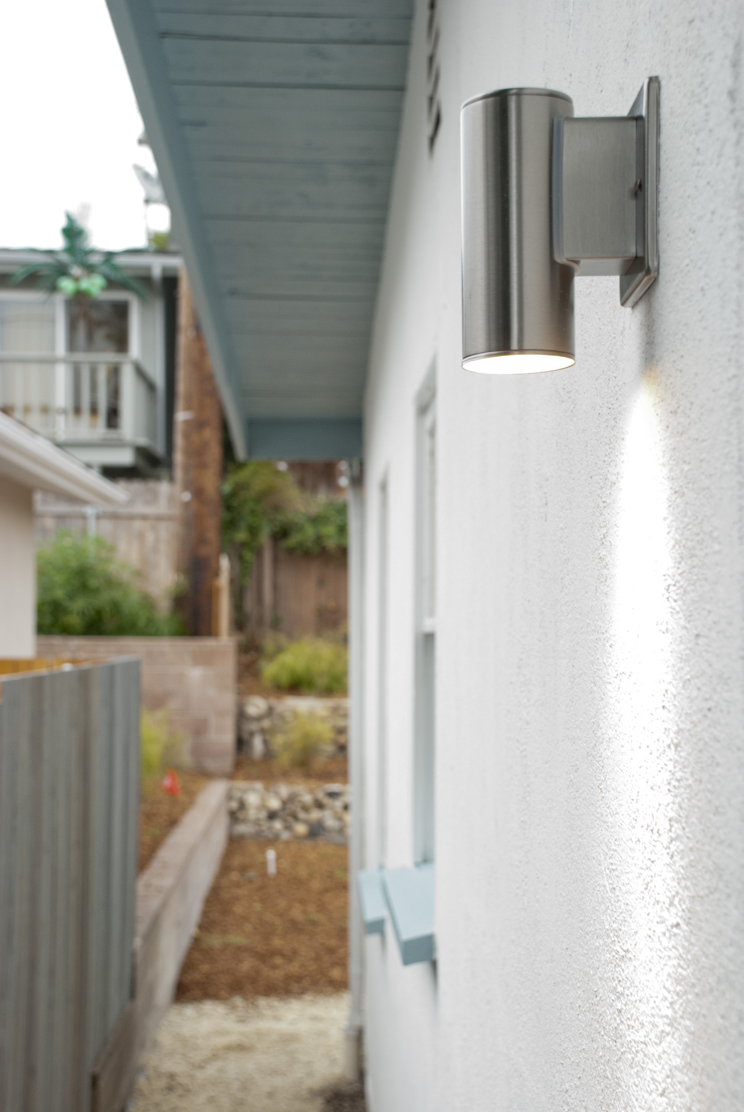
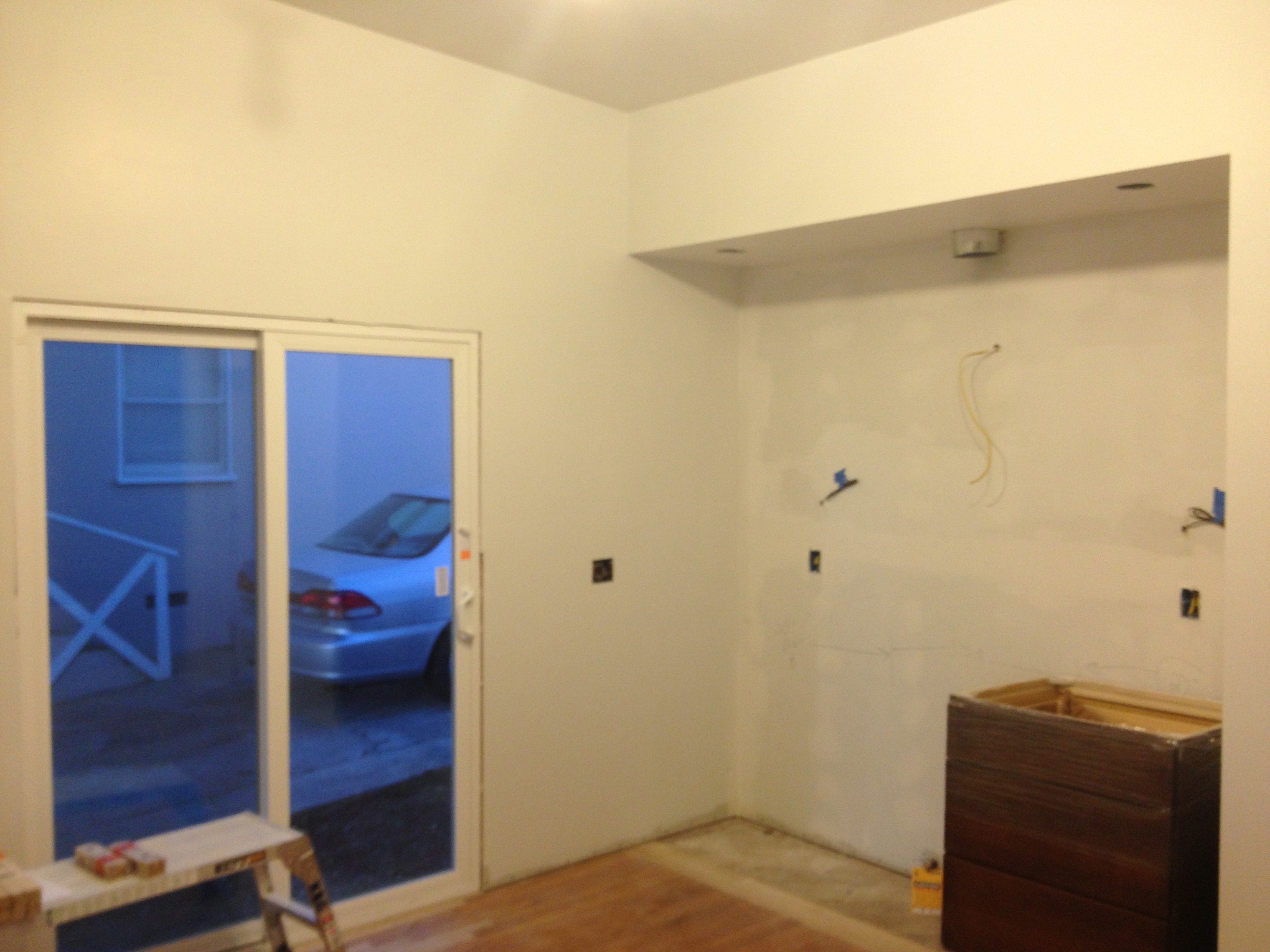
We love this new entrance to the backyard, and can’t wait to finish the landscaping and hardscaping.

DSC_0010


Painting the Exterior

We’ve resumed painting the outside again. The color scheme is a bright white for the base and a gray-blue for the trim and eaves. Notice how Chuck had the paint color matched to the gutters.

IMG_1711

By carrying the trim color all the way underneath the eaves, it accentuates them as an architectural element. The wide overhangs are one of my favorite features of the house.

IMG_1712A previous owner only painted the minimum surface necessary to photograph the house for sale. From this angle, you can see that the walls in back hadn’t been painted in years, and the green trim went just far enough to cover an older coat of garish electric blue. When we’re done, the blue gray trim and white will carry all the way across, thank you very much. The redwood fence is our new addition to screen the new kitchen sliding door entrance to the backyard.

IMG_1710


Master Bedroom Suite – A Cozy Retreat in Pismo Beach

Chuck finished the bamboo flooring treatment in the master bedroom. What a transformation! We love it. With about $200 in materials, some specialized tools, and Chuck’s design and fabrication expertise it all came together.

DSC_0004Now the whole room is a warm, cozy retreat. I love how the how the wood tones are reflected in the orange and brown wallpaper, along with more accents of orange and blue in the pillows, lamps, upholstery and carpet.

DSC_0009

Kitchen Sunrise

The kitchen is coming along nicely. A narrow slab of matching quartz will be installed on the ledge behind the sink soon. Our countertops are by Compac, a Spanish company that Chuck happens to feature in his C W Quinn Home showroom. The countertops are nearly indestructible and will look beautiful for years to come.

DSC_0001They look white in these pictures, but they’re actually pale gray to complement the color scheme in the kitchen, living room and dining room. A pure white countertop might also seem too sterile, as we want our house to look warm and inviting. Compac calls this countertop color “Luna,” and it does have the quality and shimmer of moonlight.

col3_LUNA

It’s a dramatic transformation from the original kitchen! Remember that the old kitchen was crammed into a corner of the house, and we moved it into the center.

DSC_0037And here’s my favorite view again. The waves crashing onto Pismo Beach in the morning are a soothing sight.

DSC_0004

Color Scheme Preview

And now for a preview of our color scheme. Our views are of ocean, hills, and sky so we’re going with watery cool blues and grays in the tiles, paint color, wallpaper and countertops. The wood tones in the original hardwood floors and new cabinets, along with some accent wallpaper will warm it up. We’re getting the cabinets and countertops from Chuck’s C W Quinn Home showroom in San Luis Obispo, of course. It’s very convenient to be married to a kitchen and bath designer for a project of this scope.

Image